Brand Book
The Vaisala brand is one of our most valuable assets. It's the sum of every action, experience, and encounter by our stakeholders. Here you will find the key elements of the Vaisala brand, from logo to colors to fonts.
Our products are known for their stellar quality and reliability. Let's take every measure to ensure an equally premium brand experience.
Contents
1. Overview

About us
Vaisala is a global leader in measurement instruments and intelligence for climate action. We equip our customers with devices and data to improve resource efficiency, drive energy transition, and care for the safety and well-being of people and societies worldwide.
With almost 90 years of innovation and expertise, we employ a team of over 2,300 experts committed to taking every measure for the planet. Vaisala series A shares are listed on the Nasdaq Helsinki stock exchange.
Purpose
Our purpose is Taking every measure for the planet.
Throughout its existence, Vaisala has supported data-driven weather predictions and optimized industrial processes. Now, the alarming state of the climate demands even more. It calls for us to go above and beyond – to take every measure.
Our purpose reflects how we aim to expand our role as a leader in weather and industrial measurements and deliver on our ambition to enable global climate action.
Our story
Brand architecture
Vaisala has a masterbrand architecture. All actions and expressions build the equity of one Vaisala brand identity across products and services. This is how we create a consistent, recognizable brand for all our stakeholders across channels and markets.
By adhering to the brand guidelines, we all contribute to building a unified brand. It's also why we don't create additional visual elements such as logos, graphics, colors, or taglines, neither for external nor internal use.
For Vaisala Xweather, we have assigned additional visual elements to highlight our subscription offering. For more information about the additional elements for Vaisala Xweather, please contact the brand team.

Logo
The Vaisala logo is our most important visual asset. It's form is modern, precise, and optimized for readability and application.
We use the logo in two primary color versions: Thunder Blue and white. Always use original logo files.
Clear space
The clear space around the Vaisala logo should be equal to the height of the logo.
Versions
It's forbidden to create any other color versions, alterations, or reinterpretations of the logo without the approval of Vaisala's brand team.
Colors
Vaisala’s color palette expresses the pioneering, curious and committed brand behavior and caters for a broad range of applications.
Color vision deficiency (CVD) has been taken into account when selecting our brand colors. Each brand color is distinguishable from the other, making visual communications safe and inclusive.
Thunder Blue
Ember Orange
Misty Green
Fusion Yellow
Color shade hierarchy
When using the Vaisala color palette, please follow these approximate proportions.

Color pairing
Color pairing is the foundation of both effective brand building and accessible color compositions.

The Web Content Accessibility Guidelines level AA require a contrast ratio of at least 4.5:1 for normal text and 3:1 for texts larger than 18 pt (24 px).
Choose combinations that favor as high contrast ratio as possible.
The examples on the right illustrate different levels of acceptable pairings.

Typography
Our custom font Vaisala Sans is one of the key pillars of our visual identity. With purpose in even the smallest details, the font plays with the concept of making the invisible visible.

The font’s rounded joints become more pronounced at larger sizes, adding contrast and balance to the sharper angles.

Type subfamilies and weights
Vaisala Sans includes three subfamilies, along with an array of weights and styles.
Vaisala Sans is the primary typeface. The secondary options Condensed and Mono are reserved for specific design elements and should be used sparingly.

Type hierarchy
Use different text sizes consistently to emphasize and differentiate text elements.
The example on the right shows optimal use of the font. Please note that we don't use uppercase titles or bolded ingress texts.

Icons and pictograms
Vaisala's UI icons and pictograms are versatile tools used to emphasize objects and actions, or to explain complex concepts.
The icons are influenced by the typographic style of Vaisala’s bespoke typeface, incorporating a harmonious blend of angular and rounded shapes with carefully matched stroke widths.
Our icons and pictograms are designed to be used in sizes ranging from 16 pixels to 64 pixels, with increments of 8 pixels.
Pictograms
We use pictograms to simplify and illustrate complex concepts and broader topics through visual representation.
Pictograms can also be used with 1-2 accent colors.
Hover to see accent colors in use.


UI icons
UI icons serve as functional illustrations to communicate and emphasize navigation elements within the interface.
Data visualization
Data visualizations are a great tool for communicating in an informative and unique way.

For infographics, the use of a wider color palatte becomes necessary. We recommend to use the main brand colors, supplemented with different shades if needed. Avoid unnecessary colorfulness.

Vaisala infographics and font style can also be applied to animations.
Animation style should be confident yet curious, utilizing the data particles in both subtle and more obvious ways.
Motion concept
Vaisala’s abstract motion system draws inspiration from our concept: making the invisible visible while transforming measurements into intelligence.
Our primary form is the round data point. The data points can be uniform in size or variable.
This condensed guide only includes a few example motion patterns. Please contact our brand team for more info and versions.
Images
Taking every measure for the planet is the theme throughout all brand imagery.
Our goal is to find visually captivating subjects that are rooted in the Vaisala behaviors: pioneering, curious and committed. Images should always communicate hope, joy, and positive climate action.
Climate
When selecting subject matter, prioritize their visual appearance and impact. The goal is to find dramatic, visually captivating locations and situations that effectively demonstrate Vaisala’s global relevance.
The imagery may feature people — or simply the impact of their actions.

Industries
To showcase the variety of environments we operate in, we use reportage style images with as much visual impact as possible.
These images are produced without giving emphasis to our products. Images can range from wide-angle observational to close-ups that capture human perspective.


People and culture
We show our people and culture in documentary-style images in real-life Vaisala working situations, interactions, and environments.


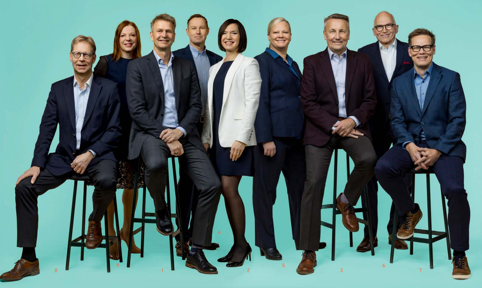
Portraits
Our people are captured in classic and approachable individual or group portraits that are infused with pioneering, curious and committed energy.
We show our team as relaxed, committed, and trustworthy professionals.

3.
Further info

Additional guidance
This public version of our brand book only contains the main elements of our brand. A more detailed version is available for our colleagues, partners, and agencies on request.
Material Hub
You can download our logo in the Logo section of this brand book.
All other Vaisala assets are available in our Material Hub. Please reach out to your own Vaisala contact to get access rights to the Material Hub.
Contact us
Our brand team is happy to work together with you to create a stellar brand experience. For more info or questions, please reach out to our brand team.
Vaisala Oyj
Vanha Nurmijärventie 21
01670 Vantaa
Finland
© Vaisala 2024